Lux Capital
App Quality Report
Powered by Testers.AI
B+89%
Quality Score
14
Pages
22
Issues
7.5
Avg Confidence
6.5
Avg Priority
1 Critical10 High11 Medium
Testers.AI
>_ Testers.AI AI Analysis

Lux Capital scored B+ (89%) with 22 issues, ranking #27 of 47 VC sites. That's 1 fewer than the 22.7 category average (40th percentile).

Top issues to fix immediately: "Large black rectangle obscures main content area" โ€” Investigate the source of this black rectangle element; "Poor contrast and readability of text on dark background" โ€” Increase the contrast ratio between text and background to meet WCAG AA standards (4; "Missing or broken hero image in Southwest Silicon header section" โ€” Verify the background image URL is correct and the image file exists on the server.

Weakest area โ€” accessibility (5/10): Dark theme with high contrast text is challenging for some users; no visible alt-text indicators, and font sizes appear small i...

Quick wins: Add a clear navigation menu that remains accessible and outlines main service categories or business units. Create a concise value proposition statement on the hero section explaining what Lux Capital does.


Qualitative Quality
Lux Capital
Category Avg
Best in Category
Issue Count by Type
UX
23
A11y
11
Content
10
Visual
4
Pages Tested ยท 14 screenshots
Detected Issues ยท 22 total
1
Large black rectangle obscures main content area
CRIT P9
Conf 9/10 VisualUX
Prompt to Fix
The issue is a large black rectangle obscuring main content on the catalysts page. Fix it by identifying the source element (likely a failed image or media load), replacing the missing asset, or removing the unintended overlay element.
Why it's a bug
A substantial black rectangle is prominently displayed in the center of the page, covering what appears to be important content. This blocks user access to information and creates a broken user experience. The element appears to be either a failed image load, a rendering error, or unintended overlay.
Why it might not be a bug
It could potentially be intentional design, but given the context of a catalyst/companies showcase page, a large black rectangle serving no apparent purpose is highly unlikely to be intentional design.
Suggested Fix
Investigate the source of this black rectangle element. If it's a failed image, ensure the image asset loads correctly. If it's a CSS rendering issue, debug the styling. If it's an unintended overlay, remove or hide the element.
Why Fix
This element completely obscures content and severely degrades the user experience, making the page appear broken and preventing users from accessing information about the featured companies.
Route To
Frontend Engineer / UI Developer
Page
Tester
Sharon ยท Security Tester
Technical Evidence
Elements: <div> or <img> element with black background or failed media element in the center of the catalyst section
Console: Potential image load failure or CSS rendering error
Network: Failed image asset request or failed video/media load
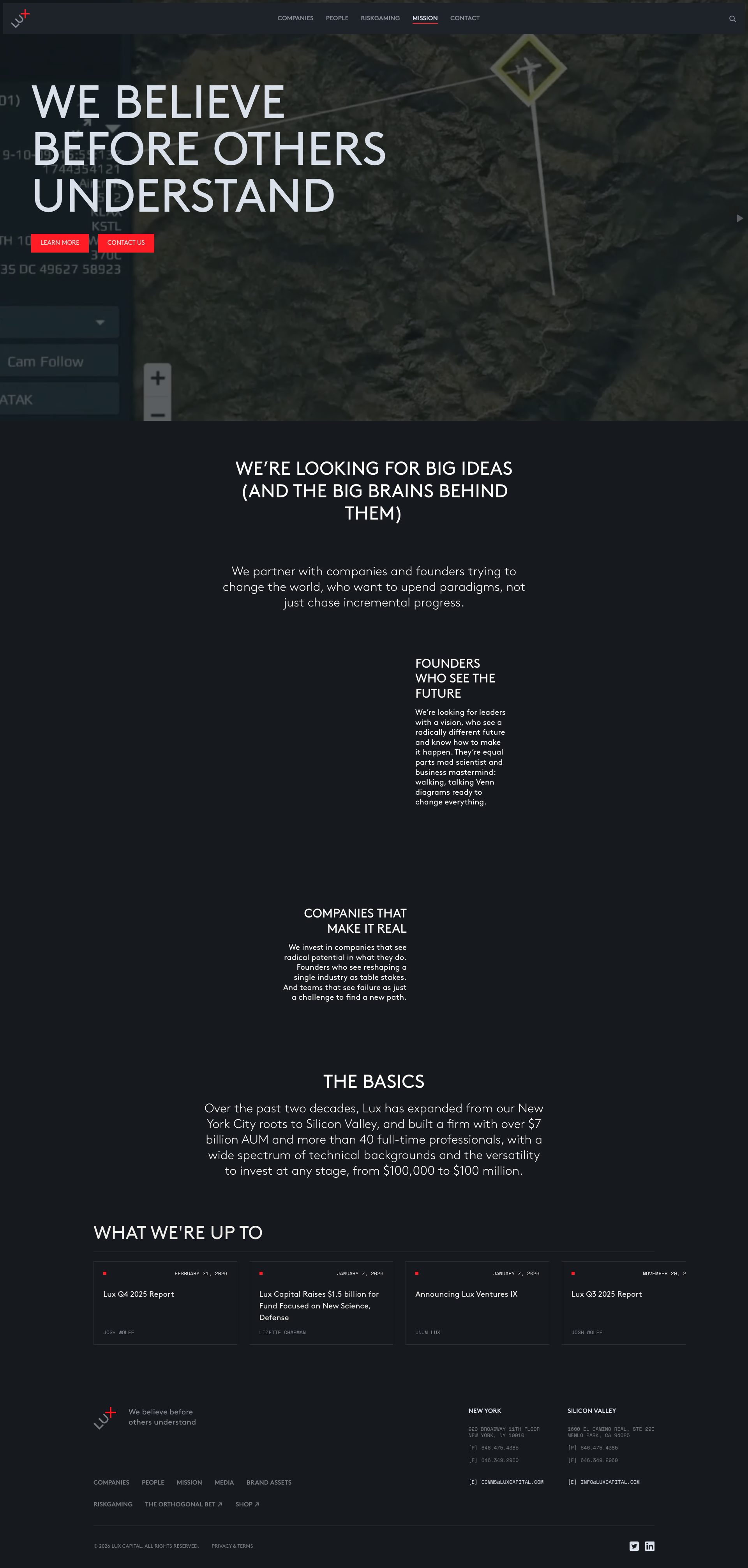
Page Text: CATALYSTS - THESE ARE THE COMPANIES MAKING WHAT'S NEXT
2
Poor contrast and readability of text on dark background
HIGH P8
Conf 8/10 UXA11y
Prompt to Fix
The issue is extremely low contrast between text and background making content unreadable and violating WCAG accessibility standards. Fix it by increasing the text color brightness or lightening the background to achieve at least 4.5:1 contrast ratio for normal text.
Why it's a bug
The screenshot shows text that is extremely difficult to read due to very low contrast between the dark text and dark background. This violates WCAG 2.1 AA standards for contrast ratio (should be at least 4.5:1 for normal text). Users with visual impairments or those viewing on certain displays will struggle to read the content.
Why it might not be a bug
This could be intentional dark mode styling, though even dark mode should maintain sufficient contrast ratios per accessibility standards.
Suggested Fix
Increase the contrast ratio between text and background to meet WCAG AA standards (4.5:1 for normal text, 3:1 for large text). Lighten the text color or adjust the background color accordingly.
Why Fix
Ensures the page is accessible to users with low vision, color blindness, or those using devices with poor display quality. Improves overall readability and user experience.
Route To
Frontend/UI Engineer, Accessibility Specialist
Page
Tester
Sharon ยท Security Tester
Technical Evidence
Elements: <body> and text content areas with dark background and dark text
Console: No console errors visible
Network: Not applicable
Page Text: Multiple lines of text are barely legible due to contrast issues
3
Placeholder/Empty Content Areas in Main Section
HIGH P7
Conf 8/10 UXContent
Prompt to Fix
The main content text under 'WE RETURN WITH CONTACT' is illegible - ensure all body text has sufficient font size (minimum 14px), color contrast ratio of at least 4.5:1 against background, and proper line height for readability
Why it's a bug
The main content area under 'WE RETURN WITH CONTACT' section appears to have text that is either not fully loaded, illegible, or intentionally placeholder content. The text is too small and unclear to read in the screenshot, suggesting either a rendering issue or incomplete content implementation.
Why it might not be a bug
This could be intentional design with blurred/faded text for visual effect, though it reduces accessibility and content clarity.
Suggested Fix
Either ensure all body text meets minimum font size and contrast standards (WCAG AA), or clarify if this is intentional design. If intentional, add visual hierarchy to make the purpose clear.
Why Fix
Users cannot read important content, which impacts usability and accessibility compliance. Content should be legible to all users.
Route To
Frontend Developer / UX Designer
Page
Tester
Sharon ยท Security Tester
Technical Evidence
Elements: <section>, <p> tags in main content area
Page Text: WE RETURN WITH CONTACT - followed by unclear/illegible body text
+19
19 more issues detected  View all →
Placeholder/Sample Image in Hero Section
Multiple instances of placeholder or dummy text visible on p...
Low contrast text on dark background reduces readability
and 16 more...
Unlock All 22 Issues
You're viewing the top 3 issues for Lux Capital.
Sign up at Testers.AI to access the full report with all 22 detected issues, detailed fixes, and continuous monitoring.
Sign Up at Testers.AI or let us run the tests for you