Craft Ventures
App Quality Report
Powered by Testers.AI
B+89%
Quality Score
14
Pages
21
Issues
7.6
Avg Confidence
6.7
Avg Priority
1 Critical11 High7 Medium2 Low
Testers.AI
>_ Testers.AI AI Analysis

Craft Ventures scored B+ (89%) with 21 issues, ranking #23 of 47 VC sites. That's 2 fewer than the 22.7 category average (49th percentile).

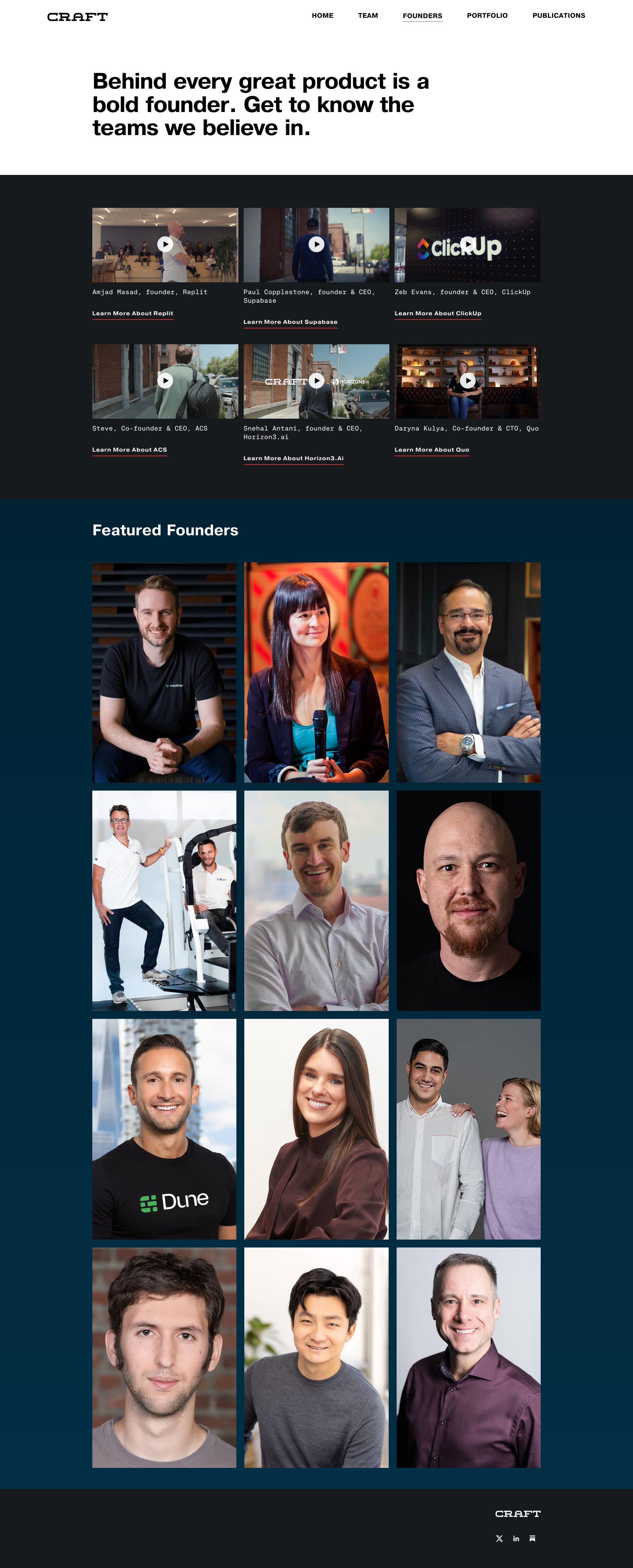
Top issues to fix immediately: "Extremely Poor Contrast and Readability - Dark Text on Dark Background" โ€” Increase color contrast by either: (1) Using lighter text colors (white, light gray) on dark backgrounds, or (2) Usin...; "Inconsistent Text Contrast in Dark Section" โ€” Increase the contrast between text and background by either lightening the text color to white or off-white, or darke...; "Accessibility concern - Featured Founders images lack visible alt text" โ€” Add descriptive alt text to all founder images that includes the founder's name and title/role.

Weakest area โ€” accessibility (5/10): Dark theme may challenge users with visual impairments.

Quick wins: Enhance text contrast ratios throughout, especially in the dark-themed sections, to meet WCAG AA standards. Add clear navigation breadcrumbs or section indicators to improve wayfinding.

Qualitative Quality
Craft Ventures
Category Avg
Best in Category
Issue Count by Type
A11y
13
Visual
13
Content
10
UX
7
Pages Tested ยท 14 screenshots
Detected Issues ยท 21 total
1
Extremely Poor Contrast and Readability - Dark Text on Dark Background
CRIT P10
Conf 9/10 UXA11y
Prompt to Fix
The issue is that the text color and background color have insufficient contrast ratio, making content illegible. Fix it by ensuring all text uses colors with a minimum 4.5:1 contrast ratio against their backgrounds, using white or light gray text on dark backgrounds or adjusting the background to be significantly darker or lighter than the current color.
Why it's a bug
The entire grid layout shows dark gray or black text on a dark gray/charcoal background, making content nearly impossible to read. This is a critical accessibility violation that violates WCAG AA standards for color contrast (requiring minimum 4.5:1 ratio for normal text). Users with visual impairments or those viewing on different monitors will be unable to read content.
Why it might not be a bug
This could be intentional dark mode styling, but even dark mode interfaces should maintain minimum contrast ratios for readability.
Suggested Fix
Increase color contrast by either: (1) Using lighter text colors (white, light gray) on dark backgrounds, or (2) Using darker backgrounds with the existing text color. Ensure all text meets WCAG AA minimum contrast ratio of 4.5:1 for normal text.
Why Fix
This is critical for accessibility compliance and usability. Users cannot read the interface content, making the application completely unusable.
Route To
Frontend/UI Engineer, Accessibility Specialist
Page
Tester
Sharon ยท Security Tester
Technical Evidence
Elements: Body background color, text color properties, grid cells containing text
Console: No console errors visible, but accessibility audit would flag contrast violations
Page Text: Grid of content with illegible text throughout the entire page
2
Inconsistent text contrast and readability on dark backgrounds
HIGH P8
Conf 7/10 UXA11y
Prompt to Fix
The issue is insufficient text contrast on dark backgrounds making content unreadable and non-compliant with WCAG accessibility standards. Fix it by increasing the contrast ratio of all body text to at least 4.5:1 by using lighter text colors or increasing font weight.
Why it's a bug
Multiple text elements throughout the grid appear to have insufficient contrast against the dark blue/black backgrounds. The body text in many card descriptions is difficult to read, which violates WCAG 2.1 AA standards requiring a minimum 4.5:1 contrast ratio for normal text.
Why it might not be a bug
The design may be intentionally stylized, but accessibility compliance is non-negotiable regardless of design intent.
Suggested Fix
Increase the font weight and/or use lighter text colors (white or near-white #F5F5F5+) for all body text on dark backgrounds. Ensure contrast ratio meets WCAG AA minimum of 4.5:1.
Why Fix
Users with low vision or color blindness cannot read the content, and the site fails accessibility compliance standards which may create legal liability.
Route To
Frontend/UX Designer
Page
Tester
Sharon ยท Security Tester
Technical Evidence
Elements: <div class='card-description'>, <p> elements within cards
Page Text: Multiple card descriptions across the grid with dark text on dark backgrounds
3
Text Overlap in 'Founders in Action' Section
MED P6
Conf 8/10 VisualUX
Prompt to Fix
The 'OBSESSION' heading is overlapping with the image grid below it. Fix this by adjusting the CSS positioning and z-index values to ensure the text and images are properly separated without visual overlap.
Why it's a bug
The word 'OBSESSION' appears to be overlapping or poorly positioned over the image grid in the 'Founders in Action' section, creating visual confusion and reducing readability of the content.
Why it might not be a bug
This could be an intentional design choice for dramatic effect, though it compromises usability.
Suggested Fix
Reposition the 'OBSESSION' text to ensure it does not overlap with the image grid, or adjust the z-index and positioning to ensure text is either clearly above or below the images without obscuring content.
Why Fix
Overlapping text reduces clarity and makes the interface appear unpolished. Clear separation of text and images improves readability and user experience.
Route To
Frontend/UI Engineer
Page
Tester
Sharon ยท Security Tester
Technical Evidence
Elements: <div class='founders-in-action'><h2>OBSESSION</h2><div class='image-grid'>
Page Text: OBSESSION
+18
18 more issues detected  View all →
Leadership team member images not loading
Advisors section images not loading
Inconsistent image loading in founder grid - missing images ...
and 15 more...
Unlock All 21 Issues
You're viewing the top 3 issues for Craft Ventures.
Sign up at Testers.AI to access the full report with all 21 detected issues, detailed fixes, and continuous monitoring.
Sign Up at Testers.AI or let us run the tests for you