Sequoia Capital
App Quality Report
Powered by Testers.AI
B+87%
Quality Score
28
Pages
30
Issues
8.0
Avg Confidence
7.2
Avg Priority
4 Critical18 High8 Medium
Testers.AI
>_ Testers.AI AI Analysis

Sequoia Capital scored B+ (87%) with 30 issues, ranking #37 of 47 VC sites. That's 7 more than the 22.7 category average (21st percentile).

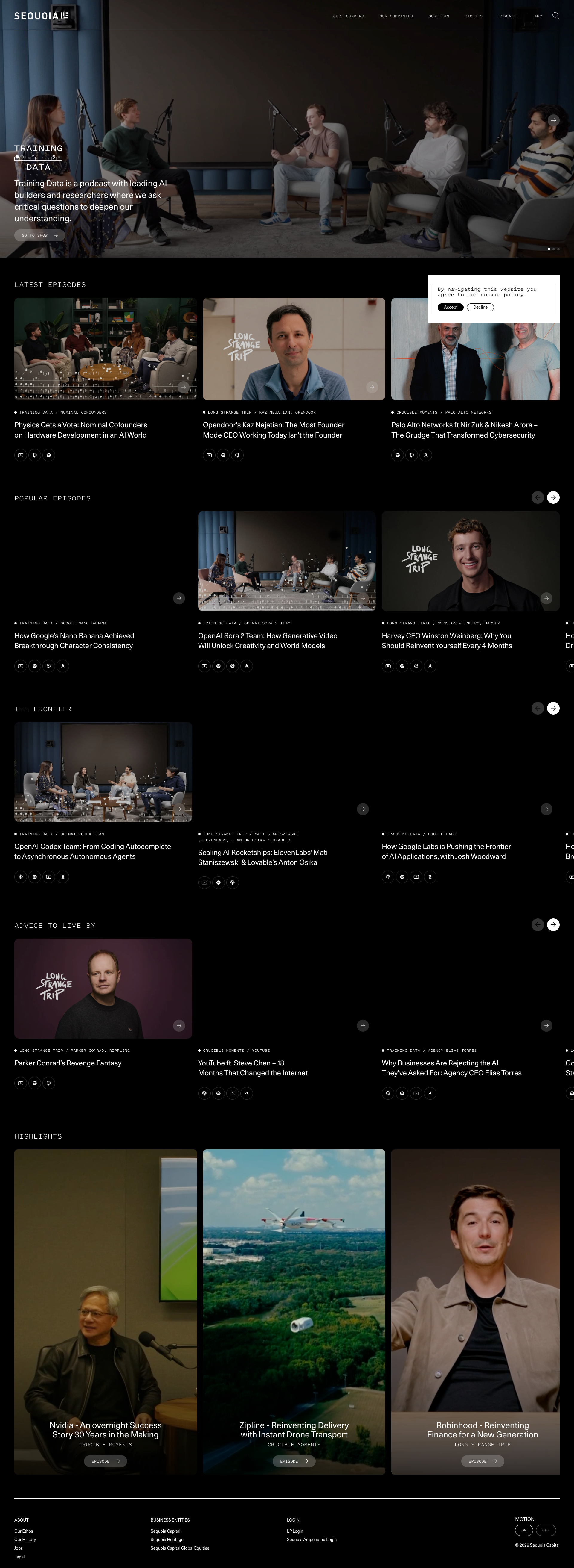
Top issues to fix immediately: "Entire page content appears extremely dark/low contrast with unreadabl" โ€” Increase the contrast between text and background elements; "Extremely poor image visibility and contrast throughout interface" โ€” Increase brightness, contrast, and ensure all UI elements have sufficient luminosity; "Extremely Poor Text Contrast on Dark Background" โ€” Increase the contrast between text color and background.

Weakest area โ€” usability (6/10): Limited visible navigation options and call-to-action buttons make it unclear where to go next; requires scrolling to discover ...

Quick wins: Add clearer navigation menu with primary service categories (Investments, Portfolio, About, News, Contact). Include a more descriptive value proposition or elevator pitch to help visitors understand Sequoia's mission.

Qualitative Quality
Sequoia Capital
Category Avg
Best in Category
Issue Count by Type
UX
38
A11y
10
Content
8
Visual
7
Pages Tested ยท 28 screenshots
Detected Issues ยท 30 total
1
Entire page content appears extremely dark/low contrast with unreadable text
CRIT P10
Conf 9/10 A11yVisualUX
Prompt to Fix
The issue is that page text and content have extremely low contrast against dark backgrounds, making the entire page unreadable and violating WCAG accessibility standards. Fix it by increasing text color brightness (use white or light gray) or decreasing background darkness, ensuring minimum 4.5:1 contrast ratio for normal text per WCAG AA standards.
Why it's a bug
The screenshot shows nearly the entire page rendered with very dark backgrounds and text that is nearly invisible or extremely difficult to read. Multiple sections of content are present but the text is not legible against the dark background, making the page completely unusable. This is a critical accessibility and usability issue.
Why it might not be a bug
This could potentially be an intentional dark mode design, but even dark mode designs should maintain sufficient contrast ratios (WCAG AA requires 4.5:1 for normal text). The contrast here appears to fall well below acceptable standards.
Suggested Fix
Increase the contrast between text and background elements. Ensure all text meets WCAG AA contrast ratio standards of at least 4.5:1 for normal text and 3:1 for large text. Review CSS styling for color values and adjust either text color to be lighter or background colors to be darker as appropriate.
Why Fix
Users cannot read the content on the page, making it completely inaccessible and unusable. This violates WCAG accessibility standards and provides a broken user experience for all visitors, including those with low vision or visual impairments.
Route To
Frontend Engineer / UI/UX Designer
Page
Tester
Sharon ยท Security Tester
Technical Evidence
Elements: Body background, text elements, all content containers showing insufficient contrast
Console: No visible console errors in screenshot
Network: No visible network errors
Page Text: Text is present but illegible due to low contrast
2
Extremely poor image visibility and contrast throughout interface
CRIT P9
Conf 9/10 A11yVisualUX
Prompt to Fix
The issue is that critical UI elements and content throughout the interface are nearly invisible due to extremely poor contrast and brightness. Fix it by auditing all CSS styling to ensure proper contrast ratios, removing excessive opacity values that obscure content, and ensuring all text and UI elements meet WCAG AA accessibility standards with sufficient luminosity.
Why it's a bug
The screenshot shows multiple sections with extremely dark or nearly black content areas where images and UI elements should be clearly visible. This creates a severely degraded user experience where users cannot see critical interface elements, buttons, text, or content. This is a fundamental usability failure that prevents users from interacting with the application effectively.
Why it might not be a bug
The darkness could theoretically be intentional dark mode styling, but even dark mode requires visible contrast and distinguishable UI elements. The current state shows nearly invisible content which is never acceptable regardless of theme.
Suggested Fix
Increase brightness, contrast, and ensure all UI elements have sufficient luminosity. Review CSS styling for background colors, opacity values, and text colors. Ensure WCAG AA contrast ratio standards (4.5:1 for text) are met throughout the interface.
Why Fix
Users cannot see or interact with the interface when content is invisible. This is a critical accessibility and usability violation that makes the application unusable.
Route To
Frontend Engineer / UI Designer
Page
Tester
Sharon ยท Security Tester
Technical Evidence
Elements: Multiple div containers, image elements, and text nodes appear to have opacity or color values rendering them invisible
Page Text: Content text is not legible in most sections
3
Extremely Poor Text Contrast on Dark Background
CRIT P9
Conf 9/10 A11yUX
Prompt to Fix
The issue is that text contrast is critically low (dark text on dark background), making content unreadable. Fix it by changing all text colors to white or light gray (#FFFFFF or #F5F5F5) to achieve WCAG AA compliant contrast ratios of at least 4.5:1 against the dark background.
Why it's a bug
The text content throughout the page appears to be very dark gray or black on a dark/black background, making it nearly illegible. This is clearly visible in the screenshot where the main content area shows text that blends into the background. This violates WCAG AA contrast ratio requirements (minimum 4.5:1 for normal text) and severely impacts readability for all users, not just those with vision impairments.
Why it might not be a bug
None - this is a clear accessibility and usability violation that is directly visible in the screenshot.
Suggested Fix
Increase the contrast between text color and background. Change text color to white or very light gray (#FFFFFF, #F5F5F5, or similar) to ensure minimum 4.5:1 contrast ratio against the dark background.
Why Fix
This is critical for accessibility compliance and basic usability. Users cannot read content that blends into the background, making the page completely unusable regardless of device or browser.
Route To
Frontend/UI Engineer, Accessibility Specialist
Page
Tester
Sharon ยท Security Tester
Technical Evidence
Elements: <body>, <p>, <div>, all text content containers
Console: No console errors visible, but accessibility audit tools would flag contrast violations
Page Text: Content text is present but illegible due to contrast issues
+27
27 more issues detected  View all →
Black boxes obscuring content in multiple sections
Cookie policy modal overlapping content
Cookie Policy Modal Overlays Content
and 24 more...
Unlock All 30 Issues
You're viewing the top 3 issues for Sequoia Capital.
Sign up at Testers.AI to access the full report with all 30 detected issues, detailed fixes, and continuous monitoring.
Sign Up at Testers.AI or let us run the tests for you