Innovation Endeavors
App Quality Report
Powered by Testers.AI
B+89%
Quality Score
15
Pages
21
Issues
7.7
Avg Confidence
6.7
Avg Priority
2 Critical8 High11 Medium
Testers.AI
>_ Testers.AI AI Analysis

Innovation Endeavors scored B+ (89%) with 21 issues, ranking #22 of 47 VC sites. That's 2 fewer than the 22.7 category average (49th percentile).

Top issues to fix immediately: "Missing alt text on content grid images" โ€” Add proper alt text to all images in the content grid; "Terms of Service page displays unreadable text due to extremely small " โ€” Increase the base font size of the Terms of Service document to at least 14-16px; "Text readability issue - white text on light blue background in hero s" โ€” Increase contrast by either darkening the text color to a darker shade, lightening the background, or adding a semi-t....

Weakest area โ€” accessibility (5/10): Text contrast appears adequate in some areas but may be problematic in others. No visible alt text attributes shown.

Quick wins: Add comprehensive alt text to all images and ensure WCAG 2.1 AA compliance. Expand content to clearly explain the company's services, mission, and value proposition early in the page.

Qualitative Quality
Innovation Endeavors
Category Avg
Best in Category
Issue Count by Type
UX
16
Visual
12
A11y
8
Content
7
Pages Tested ยท 15 screenshots
Detected Issues ยท 21 total
1
Terms of Service page displays unreadable text due to extremely small font size
CRIT P9
Conf 9/10 A11yUX
Prompt to Fix
The issue is that the Terms of Service page displays text at an unreadable font size, violating accessibility standards. Fix it by increasing the base font size to at least 14-16px and ensuring proper line spacing of 1.5 or greater throughout the document.
Why it's a bug
The entire Terms of Service document is displayed with text so small that it is virtually illegible in the screenshot. This violates WCAG accessibility guidelines (minimum font size of 12px for body text) and makes it impossible for users to read and understand the legal terms they are being presented with. This is a critical accessibility and usability failure.
Why it might not be a bug
The content may render correctly on different screen sizes or zoom levels, but the screenshot clearly shows the text is too small to be reasonably readable at normal viewing distance.
Suggested Fix
Increase the base font size of the Terms of Service document to at least 14-16px. Ensure proper line spacing (1.5 or greater) for better readability. Consider using a more readable font family if the current one contributes to the legibility issue.
Why Fix
Users need to be able to actually read and understand terms of service before agreeing to them. Current state violates accessibility standards and creates a poor user experience. This could also expose the company to legal liability if users claim they couldn't read the terms.
Route To
Frontend Engineer / UX Designer
Page
Tester
Sharon ยท Security Tester
Technical Evidence
Elements: 
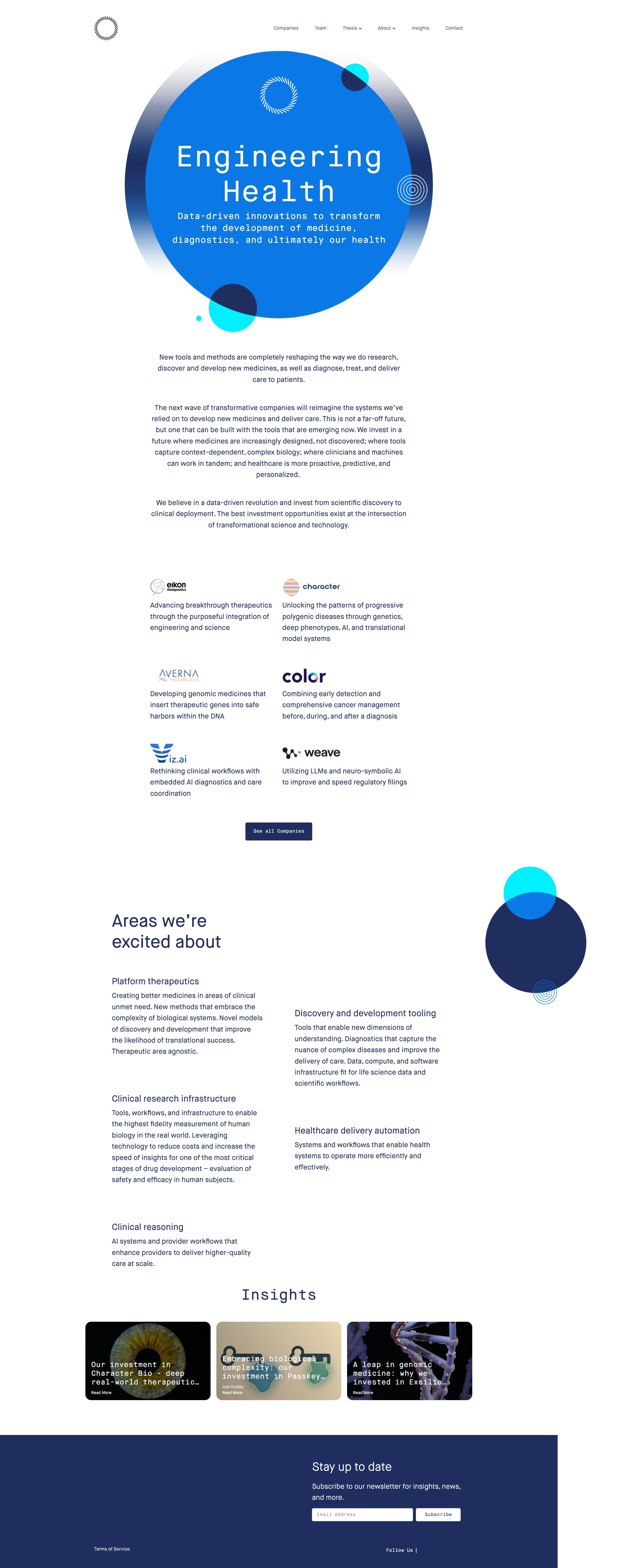
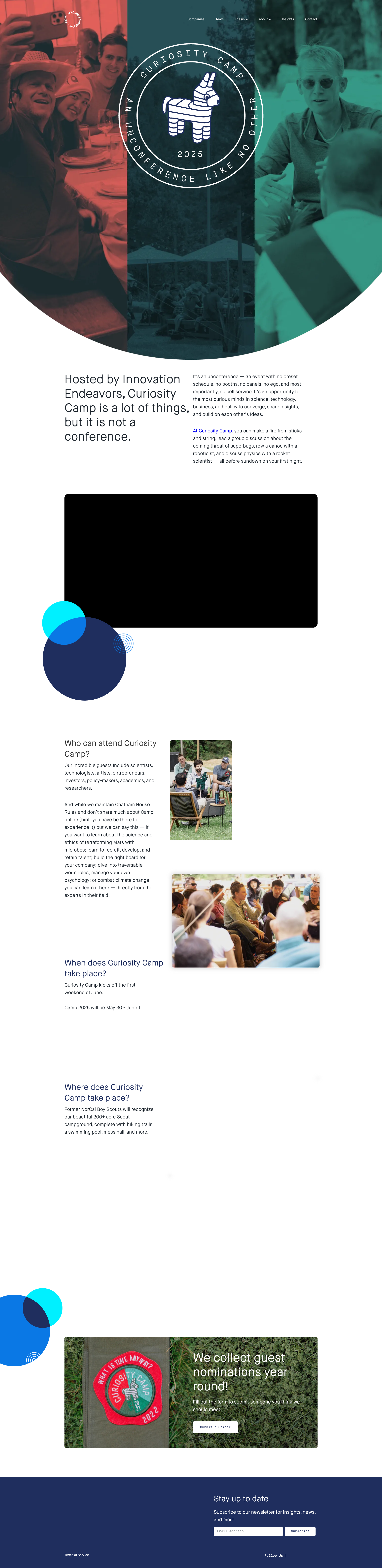
<body> text, <p> elements, main content container styling
Network: No network errors visible
Page Text: Terms of Service - [all text content is too small to read clearly in screenshot]
2
Large black rectangle placeholder with no visible content
HIGH P8
Conf 9/10 ContentUX
Prompt to Fix
The issue is a large black rectangle placeholder with no visible content in the middle of the page, and fix it by loading the appropriate image, video, or media content and verifying all resource paths are correct and accessible.
Why it's a bug
A large black rectangular area is clearly visible in the middle section of the page where content should be displayed. This appears to be a missing image, broken video embed, or unloaded content placeholder that significantly disrupts the visual layout and user experience.
Why it might not be a bug
The black rectangle could be intentional design, though this is unlikely given the context of a website that should display meaningful content.
Suggested Fix
Load and display the appropriate content (image, video, or other media) that should appear in this section. If it's an image, verify the image path and ensure it's accessible. If it's embedded media, check the embed code.
Why Fix
Users cannot see the intended content, which breaks the information architecture and creates a poor user experience. This likely represents incomplete development or a broken content delivery.
Route To
Frontend Engineer / Full Stack Engineer
Page
Tester
Sharon ยท Security Tester
Technical Evidence
Elements: <div> or <img> or <video> or <iframe> with black background or missing src attribute
Console: Potential image 404 errors or failed resource loading
Network: Failed image/video resource requests
Page Text: Content area between circular design element and 'Who we started with' section
3
Text readability issue - white text on light blue background in hero section
HIGH P8
Conf 8/10 A11yUX
Prompt to Fix
The issue is insufficient color contrast between the white text and bright blue background in the hero section. Fix it by increasing the contrast ratio to meet WCAG AA standards (minimum 4.5:1 for normal text) through either darkening the text, adjusting the background color, or adding a semi-transparent overlay.
Why it's a bug
The 'Engineering Health' heading and subtitle text appear to be white or very light colored on a bright blue circular background. While some contrast exists, the readability could be compromised for users with low vision or color blindness, and may not meet WCAG AA standards for color contrast ratios.
Why it might not be a bug
The text is still visible in the screenshot, so basic readability is maintained. The contrast ratio may technically meet minimum standards depending on exact color values.
Suggested Fix
Increase contrast by either darkening the text color to a darker shade, lightening the background, or adding a semi-transparent overlay/drop shadow behind the text to improve readability.
Why Fix
Improved contrast ensures WCAG compliance and better accessibility for all users, particularly those with visual impairments or reading in bright lighting conditions.
Route To
Frontend/Accessibility Engineer
Page
Tester
Sharon ยท Security Tester
Technical Evidence
Elements: <h1> with white text on blue circular background element
Console: No console errors visible
Page Text: Engineering Health - It's in our commitment to improve the lives of people everywhere
+18
18 more issues detected  View all →
Text overlap on hero section - 'The Super Evolution is here'...
Missing or broken team member images in grid layout
Text readability issue - white text on light blue background...
and 15 more...
Unlock All 21 Issues
You're viewing the top 3 issues for Innovation Endeavors.
Sign up at Testers.AI to access the full report with all 21 detected issues, detailed fixes, and continuous monitoring.
Sign Up at Testers.AI or let us run the tests for you