CRV
App Quality Report
Powered by Testers.AI
B86%
Quality Score
23
Pages
34
Issues
7.4
Avg Confidence
6.2
Avg Priority
11 High23 Medium
Testers.AI
>_ Testers.AI AI Analysis

CRV scored B (86%) with 34 issues, ranking #41 of 47 VC sites. That's 11 more than the 22.7 category average (15th percentile).

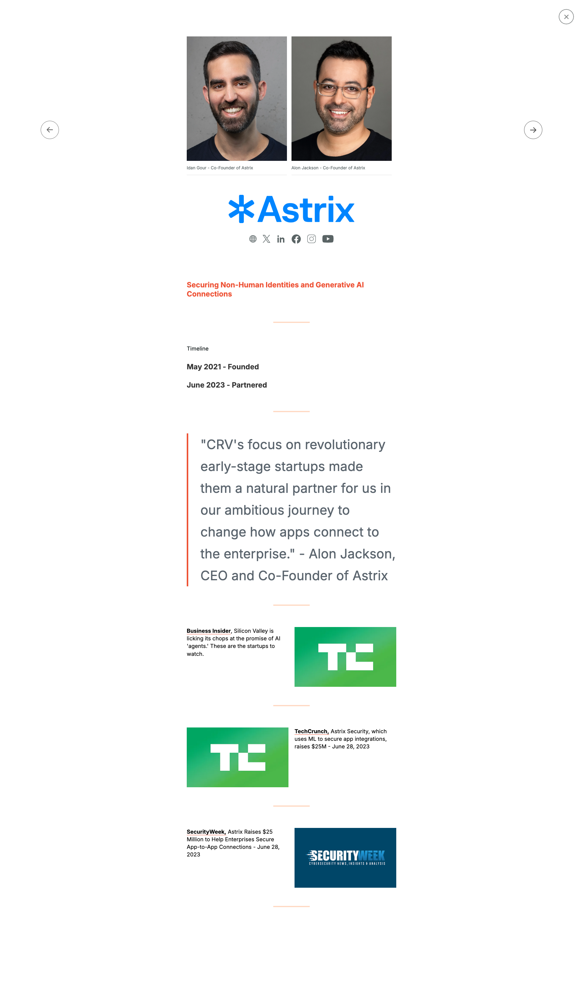
Top issues to fix immediately: "Missing alt text on founder profile images" โ€” Add descriptive alt text to both founder images, such as 'Alon Jackson, CEO and Co-Founder of Astrix' and similar des...; "Insufficient color contrast in footer social media icons" โ€” Increase the color contrast of the social media icons by either: 1) Making the icons a brighter/lighter shade, 2) Add...; "Missing or broken images in content grid" โ€” Verify all image URLs are correct and accessible.

Weakest area โ€” accessibility (5/10): Small text in footer may be difficult to read for visually impaired users. Team photos lack visible alt text indicators.

Qualitative Quality
CRV
Category Avg
Best in Category
Issue Count by Type
UX
28
A11y
20
Content
13
Visual
7
Pages Tested ยท 23 screenshots
Detected Issues ยท 34 total
1
Missing or broken images in content grid
HIGH P7
Conf 8/10 VisualUX
Prompt to Fix
The issue is that multiple article thumbnail images are missing from the content grid. Fix it by verifying all image asset URLs are correct, ensuring images are properly served with appropriate caching headers, and adding loading states or fallback images for failed loads.
Why it's a bug
Multiple thumbnail images in the grid layout appear to be missing, showing blank or placeholder spaces where article images should be displayed. This breaks the visual hierarchy and makes the page appear incomplete or broken.
Why it might not be a bug
Images could be loading asynchronously and may appear after page load, though they should be visible in a static screenshot.
Suggested Fix
Verify all image URLs are correct and accessible. Ensure images are properly referenced in the HTML/CSS and have appropriate fallback states or loading indicators while fetching.
Why Fix
Missing images degrade user experience, make content less scannable, and reduce engagement with articles. Users may assume the page is broken or incomplete.
Route To
Frontend Engineer / QA Engineer
Page
Tester
Sharon ยท Security Tester
Technical Evidence
Elements: <img> tags in article grid, .article-thumbnail classes
Console: Potential 404 errors for image resources
Network: Failed image load requests
Page Text: News, Insights and Conversations
2
Poor readability due to small font size and low contrast
HIGH P7
Conf 8/10 A11yUX
Prompt to Fix
The issue is that text throughout the page is too small and has poor contrast, making it difficult to read. Fix it by increasing the base font size to at least 16px and ensuring all text meets WCAG AA contrast ratio requirements (4.5:1 for normal text).
Why it's a bug
The body text throughout the page appears significantly small and difficult to read. Multiple sections of content have reduced contrast between text and background, making it challenging for users with visual impairments or those viewing on smaller screens to comfortably read the content.
Why it might not be a bug
This may be intentional design for a specific use case or device, though WCAG guidelines recommend minimum 16px font size for body text and sufficient contrast ratios.
Suggested Fix
Increase base font size to minimum 16px for body text, ensure contrast ratio meets WCAG AA standards (4.5:1 for normal text), and test with accessibility tools.
Why Fix
Improves accessibility for users with low vision, elderly users, and those on mobile devices. Meets WCAG 2.1 standards and provides better user experience overall.
Route To
Frontend/Accessibility Engineer
Page
Tester
Sharon ยท Security Tester
Technical Evidence
Elements: <body>, <p>, <article>, text content containers
Page Text: Multiple sections with body text content displayed at small font sizes throughout the entire page
3
Poor readability due to small font size and dense text layout
HIGH P7
Conf 8/10 A11yUX
Prompt to Fix
The issue is poor readability due to small font size and dense text layout. Fix it by increasing base font size to 14-16px minimum, adding 1.5x-2x line spacing, and increasing whitespace between sections.
Why it's a bug
The screenshot shows a long-form document with very small text that is difficult to read. The content appears to be densely packed with minimal whitespace, making it challenging for users to scan and comprehend the information. This violates WCAG accessibility guidelines for readability.
Why it might not be a bug
This could be intentional design for a document format, though accessibility standards still require minimum font sizes.
Suggested Fix
Increase base font size to at least 14-16px for body text. Add more line spacing (1.5x or 2x), increase paragraph margins, and break up dense text blocks into shorter sections with clear headings.
Why Fix
Improved readability directly impacts user experience and accessibility compliance, especially for users with vision impairments or reading difficulties.
Route To
Frontend/UX Engineer, Accessibility Specialist
Page
Tester
Sharon ยท Security Tester
Technical Evidence
Elements: Body text, paragraph elements, heading elements
Console: No console errors visible
Network: None identified
Page Text: Multiple paragraphs of small text throughout the document with minimal spacing
+31
31 more issues detected  View all →
Multiple instances of repeated section headings and content
Poor text contrast and readability in main content area
Inconsistent text color and readability in body content
and 28 more...
Unlock All 34 Issues
You're viewing the top 3 issues for CRV.
Sign up at Testers.AI to access the full report with all 34 detected issues, detailed fixes, and continuous monitoring.
Sign Up at Testers.AI or let us run the tests for you