A94%
Quality Score
2
Pages
16
Issues
8.2
Avg Confidence
7.9
Avg Priority
8 Critical5 High3 Medium
>_ Testers.AI
AI Analysis
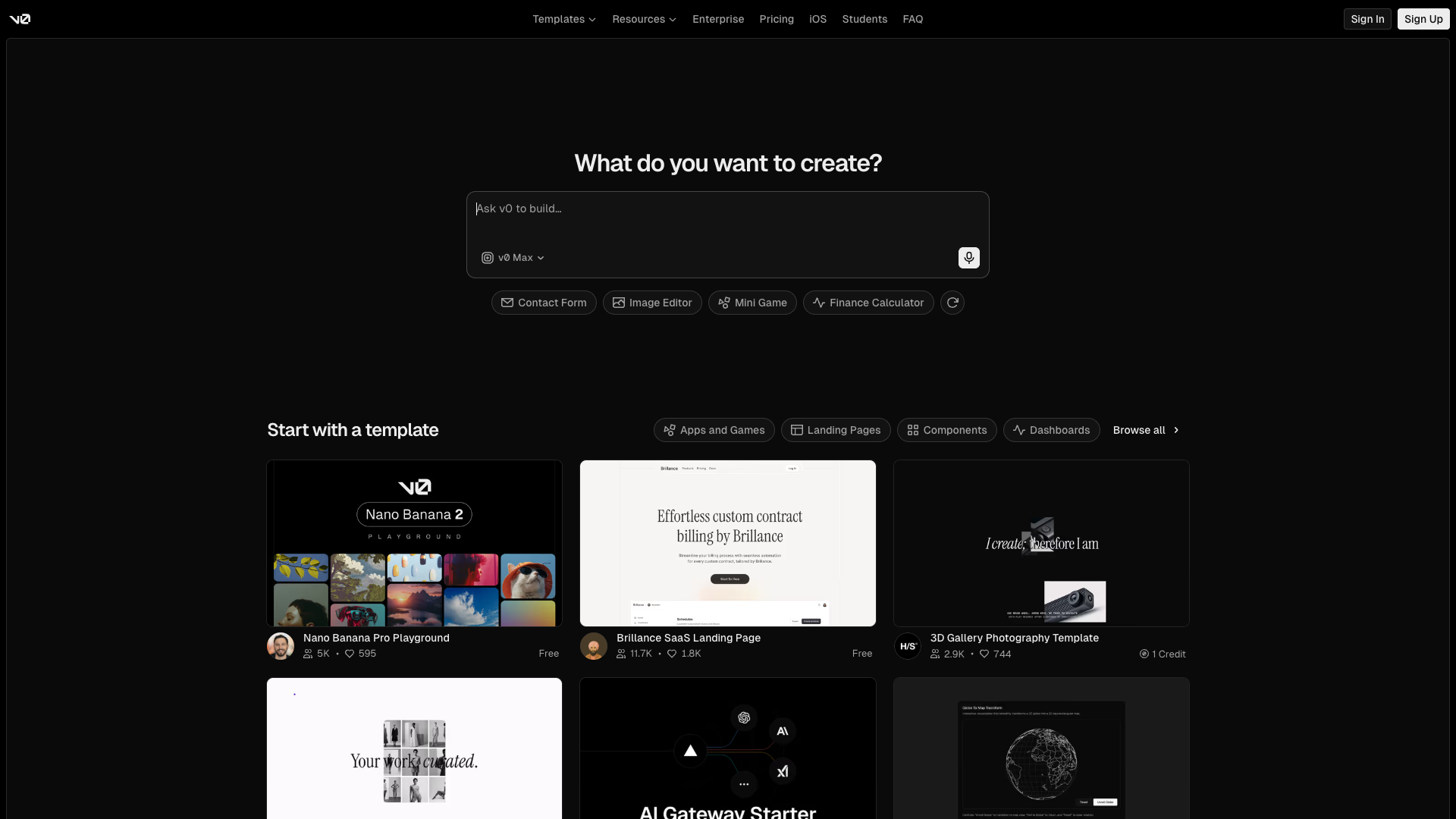
v0 by Vercel was tested and 16 issues were detected across the site. The most critical finding was: Masonry-like card grid with unequal card heights in 'Start with a template' section. Issues span A11y, Content, UX, Other categories. Persona feedback rated Visual highest (8/10) and Accessibility lowest (6/10).
Qualitative Quality
v0 by Vercel
Category Avg
Best in Category
Pages Tested · 2 screenshots
Homepage

v0.dev
Detected Issues · 16 total
1
Masonry-like card grid with unequal card heights in 'Start with a template' section
CRIT P9
Prompt to Fix
Set a fixed height or uniform aspect ratio for all .template-card elements (e.g., height: 320px; display: flex; flex-direction: column). Ensure images use object-fit: cover and the inner content has consistent padding so all cards align to a uniform grid.
Why it's a bug
Template cards appear to have inconsistent heights, causing an uneven grid that makes scanning and comparing templates harder and visually distracting.
Why it might not be a bug
Some content variations can lead to different card heights by design, but in a gallery/grid context consistency generally improves readability and task completion.
Suggested Fix
Enforce uniform card height or a fixed aspect ratio for all template cards; use object-fit: cover for thumbnails; ensure consistent vertical rhythm and padding across cards.
Why Fix
A consistent grid improves scannability, reduces cognitive load, and speeds template selection, improving task success and satisfaction.
Route To
Frontend Engineer / UI Developer
Page
Tester
 Mia · Usability Tester
Technical Evidence
Elements:
Template card grid, card images, titles, price/credit labelsPage Text:
Start with a template2
Informative avatar images use non-descriptive alt text
CRIT P9
Prompt to Fix
Audit all avatar <img> elements used within template cards. For each image, replace alt='Avatar' with a descriptive alt such as alt='Avatar: Jane Doe' or alt='Avatar: John Smith' or set alt='' if the image is decorative only. Ensure names are programmatically linked where possible for dynamic content. This aligns with WCAG 2.1 1.1.1 (Non-text Content) and 1.1.5 (Text Alternatives).
Why it's a bug
Avatar images convey user identity in template cards but their alt text is a generic 'Avatar', which does not describe who the avatar represents or its purpose. Screen reader users will not gain helpful context from these images.
Why it might not be a bug
If avatars are purely decorative, empty alt text would be appropriate; however, in this UI they appear to represent real users, making generic alt text insufficient.
Suggested Fix
Provide meaningful alt text for each avatar, e.g. 'Avatar: Jane Doe' or 'User Jane Doe' or remove the image from assistive flow if it is decorative (alt=''). Ensure the alt text is dynamically set to reflect the person's name when available.
Why Fix
Descriptive avatar alt text improves comprehension for screen reader users and preserves context when scanning template cards.
Route To
Frontend Developer / Accessibility Engineer
Page
Tester
 Alejandro · Accessibility Specialist
Technical Evidence
Console:
[ERROR] Failed to load resource: the server responded with a status of 404 ()Network:
https://v0.app/chat-static/_next/static/chunks/0a.13lqyo3q-b.css?dpl=dpl_7FHJnGEonRNddN8knKAwEJqbPDQh3
Search hero input lacks accessible label and clear placeholder contrast
HIGH P8
Prompt to Fix
Add a visible label for the search input (e.g., <label for='create-input'>What do you want to create?</label>) and ensure the input has id='create-input' with aria-label. Improve contrast by using a darker label or adjusting placeholder color to meet WCAG AA contrast requirements.
Why it's a bug
The search/input area relies on a placeholder for meaning, which is not a sufficient label for screen readers. Placeholder text also appears light on dark background, reducing readability.
Why it might not be a bug
Placeholder-only cues can be acceptable for non-accessible demos, but for a primary action like 'What do you want to create?' it should have a proper label.
Suggested Fix
Add a visible label above or inside the input (e.g., 'Ask V0 to build...'), and/or add aria-label on the input. Improve contrast for placeholder text or replace it with a persistent label to improve legibility.
Why Fix
Improves accessibility and readability, helping all users understand the input's purpose and reducing confusion.
Route To
UX Designer / Accessibility Specialist / Frontend Engineer
Page
Tester
Mia · Usability TesterTechnical Evidence
Elements:
Search input area with microphone iconPage Text:
What do you want to create?