A93%
Quality Score
2
Pages
9
Issues
8.6
Avg Confidence
8.0
Avg Priority
3 Critical5 High1 Medium
>_ Testers.AI
AI Analysis
Perplexity was tested and 9 issues were detected across the site. The most critical finding was: Empty button labels render as invisible placeholders. Issues span A11y, Performance, Other, UX categories. Persona feedback rated Visual highest (7/10) and Accessibility lowest (6/10).
Qualitative Quality
Perplexity
Category Avg
Best in Category
Pages Tested · 2 screenshots
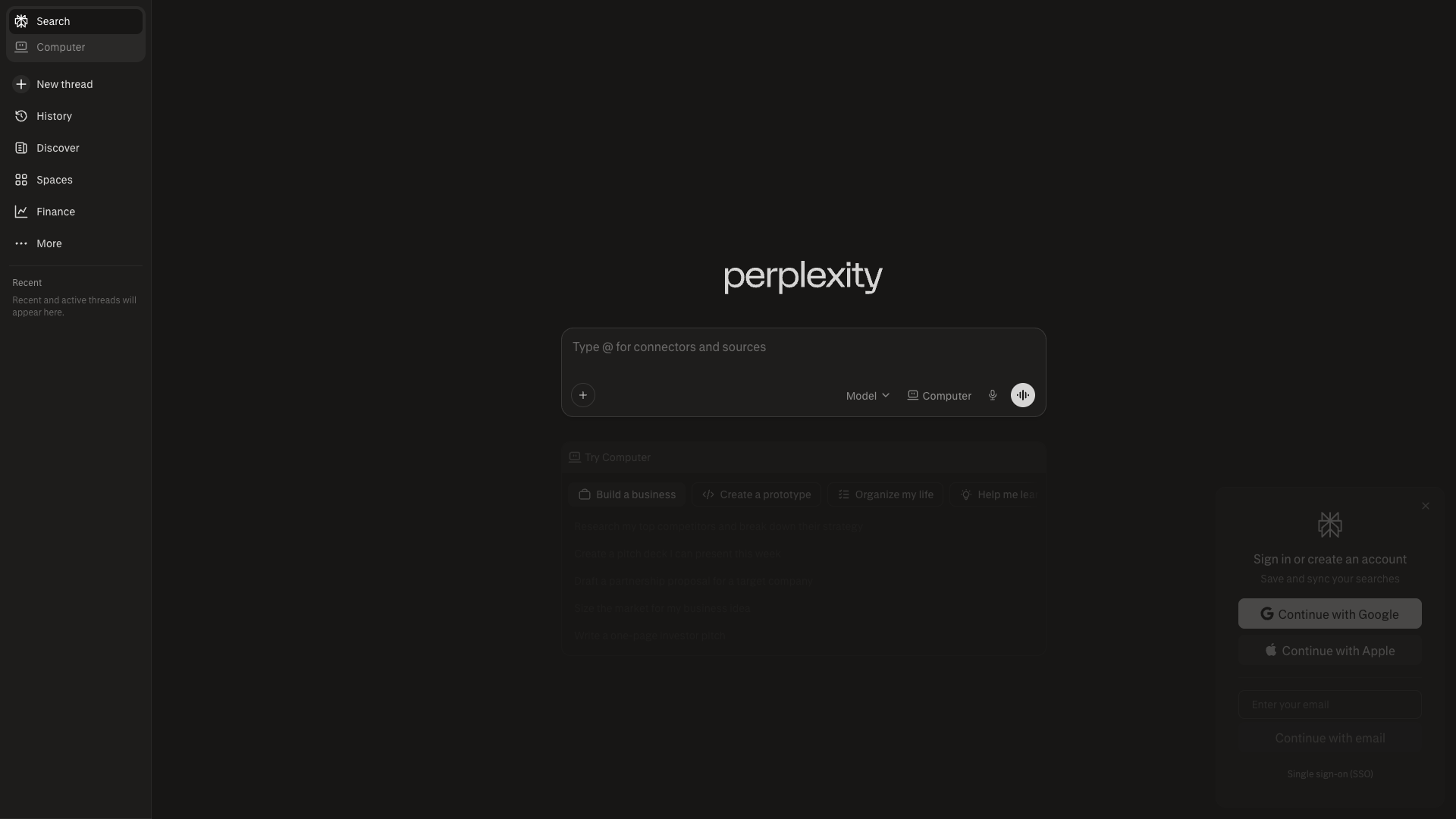
Homepage

perplexity.ai
Detected Issues · 9 total
1
Empty button labels render as invisible placeholders
CRIT P9
Prompt to Fix
Review the Page Content JSON that renders the top navigation buttons. Remove any Button entries where text is an empty string. Replace them with properly labeled controls or icons with explicit aria-label attributes. Ensure all interactive elements have visible text or accessible names and test rendering across themes.
Why it's a bug
The page content data includes Button entries with text set to an empty string, which will render as invisible or unlabeled actions. This is clearly a placeholder artifact likely introduced by AI-generated code and degrades usability and accessibility.
Why it might not be a bug
If these buttons are meant to be icon-only controls, it should include visible icons and accessible labels; as-is they are effectively non-interactive from a user perspective.
Suggested Fix
Remove the empty-text Button entries or populate them with meaningful labels. Ensure each button has an accessible name (aria-label or visible text) and consider conditional rendering to avoid empty controls. Validate UI rendering with a11y checks.
Why Fix
Visible, labeled actions are essential for task completion and accessibility; leaving unlabeled buttons can confuse users and violate UX standards.
Route To
Frontend Engineer
Page
Tester
 Jason · GenAI Code Analyzer
2
Unnamed buttons with no accessible name (empty text) in UI
CRIT P9
Prompt to Fix
Audit all <button> elements in the main UI. For each button with no accessible label, add an explicit accessible name: either keep visible text or attach aria-label/aria-labelledby referencing a visible label element. If a button is a decorative icon, set aria-hidden="true". Ensure WCAG 2.1 success criteria 2.5.3 (Keyboard) and 4.1.2 (Name, Role, Value) are satisfied.
Why it's a bug
Buttons in the UI are present but have no accessible name (empty text and no aria-label). Screen readers rely on visible text or ARIA labels to announce the purpose of interactive controls; without names, keyboard and screen reader users cannot understand or activate these controls.
Why it might not be a bug
If these controls are purely decorative icons, they should be aria-hidden or visually labeled; however, the current markup shows multiple unnamed buttons intended for interaction, which is a usability risk.
Suggested Fix
Provide meaningful accessible names for every button (use visible text or add aria-label/aria-labelledby). For purely decorative icons, mark them as aria-hidden="true" to remove them from the accessibility tree.
Why Fix
Ensures screen reader users can understand and reliably activate UI controls, improving task completion and trust.
Route To
Frontend/UI Engineer
Page
Tester
 Alejandro · Accessibility Specialist
3
Right-side sign-in panel is a modal without proper ARIA role and focus management
HIGH P8
Prompt to Fix
Implement a proper accessible dialog for the right-side sign-in panel: set role='dialog', aria-modal='true', and an explicit aria-label. Ensure the element receives focus when opened, implements a focus trap, and returns focus to the opener on close. Add aria-describedby with a brief description of the panel contents and ensure the ESC key closes the dialog. Review for WCAG 2.1 1.1.1 (Non-text content) and 4.1.2 (Name, Role, Value).
Why it's a bug
The sign-in panel appears as an overlay on the right but there is no clear ARIA role (e.g., role="dialog"), label, or focus management described. Screen readers may not announce it as a dialog, and keyboard focus may not be trapped or returned to the triggering element, hindering interaction for users relying on keyboard navigation or ATs.
Why it might not be a bug
If the panel is already implemented with proper ARIA roles and focus management in the underlying code, this would not be a bug; however, from the screenshot there is no explicit indication of a dialog role or focus handling.
Suggested Fix
Wrap the panel in a container with role="dialog", aria-modal="true", and an accessible label (aria-labelledby or aria-label). Move initial focus to the dialog when opened, trap focus within the dialog, and return focus to the triggering control on close. Provide aria-describedby for contextual explanation and ensure ESC closes the dialog.
Why Fix
Critical for users who rely on screen readers and keyboard navigation to understand and complete sign-in actions; prevents disorientation and ensures accessible interaction with authentication flows.
Route To
Frontend/Accessibility Engineer
Page
Tester
Alejandro · Accessibility SpecialistTechnical Evidence
Console:
Console shows CORS/script loading errors unrelated to accessibility but may impact login features