First Round Capital
App Quality Report
Powered by Testers.AI
B+88%
Quality Score
20
Pages
25
Issues
7.7
Avg Confidence
6.9
Avg Priority
3 Critical12 High10 Medium
Testers.AI
>_ Testers.AI AI Analysis

First Round Capital scored B+ (88%) with 25 issues, ranking #30 of 47 VC sites. That's 2 more than the 22.7 category average (34th percentile).

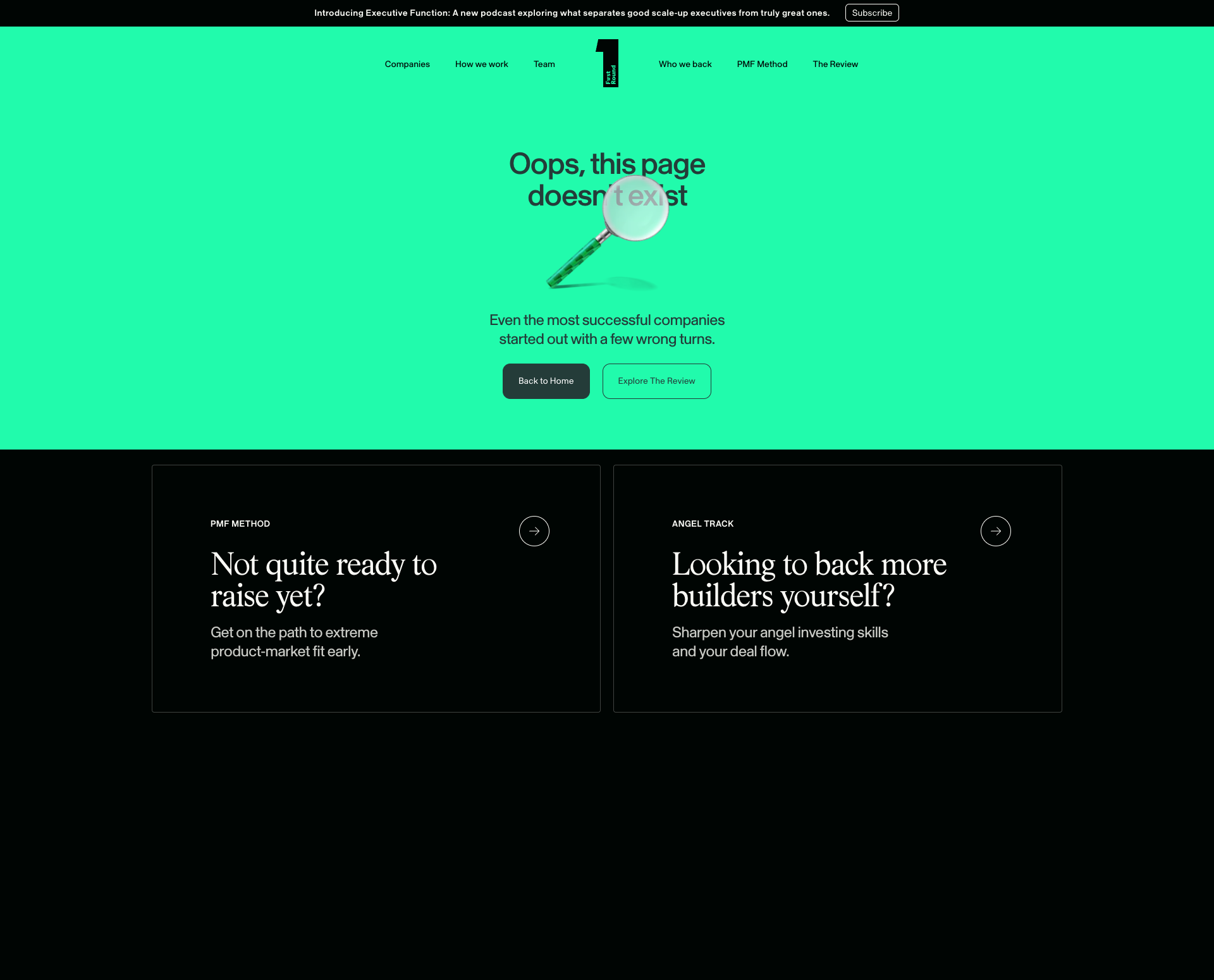
Top issues to fix immediately: "Large black rectangle obscuring content in lower section" โ€” Remove the black rectangle element or set its visibility to hidden; "Privacy Policy Content Illegible Due to Dark Text on Dark Background" โ€” Ensure sufficient color contrast between text and background; "Incomplete/Incorrect Text Display in Main Heading" โ€” Replace 'Oops, this page doesn't text' with 'Oops, this page doesn't exist' to provide the correct error message.

Weakest area โ€” accessibility (5/10): Minimal text alternatives visible, contrast ratios appear adequate but could be verified.

Quick wins: Add explicit navigation menu with clear information architecture for easier access to key service areas. Implement skip-to-content links and ensure all interactive elements have visible focus states for keyboard navigation.

Qualitative Quality
First Round Capital
Category Avg
Best in Category
Issue Count by Type
UX
21
A11y
11
Visual
11
Content
8
Pages Tested ยท 20 screenshots
Detected Issues ยท 25 total
1
Large black rectangle obscuring content in lower section
CRIT P9
Conf 9/10 VisualUX
Prompt to Fix
The issue is that a large black rectangle is obscuring page content in the lower section. Fix it by removing or hiding this element and ensuring all page content is visible and accessible to users.
Why it's a bug
A large black rectangular element is clearly visible in the lower portion of the screenshot, completely obscuring content that should be visible. This blocks user access to information and creates a broken visual experience.
Why it might not be a bug
This could potentially be an intentional design element, though there is no clear purpose for a large black rectangle to obscure content on a landing page.
Suggested Fix
Remove the black rectangle element or set its visibility to hidden. If it's a background image or styling issue, review the CSS for the affected section and correct the z-index or display properties.
Why Fix
Obscured content prevents users from accessing information and significantly degrades the user experience. All content should be readable and accessible.
Route To
Frontend Engineer / UI Developer
Page
Tester
Sharon ยท Security Tester
Technical Evidence
Elements: Black rectangular div or section element in lower portion of page
Console: No console errors visible
Network: Not applicable
Page Text: Content underneath black rectangle is not legible
2
Privacy Policy Content Illegible Due to Dark Text on Dark Background
CRIT P9
Conf 9/10 UXA11yContent
Prompt to Fix
The issue is that the Privacy Policy page has dark text on a dark background making it completely illegible and violating WCAG accessibility standards. Fix it by applying sufficient color contrast - use white or light text on the dark background with a minimum contrast ratio of 4.5:1, or switch to a light background with dark text, and verify the fix meets WCAG AA standards.
Why it's a bug
The privacy policy page displays text that is extremely difficult or impossible to read. The content appears to be dark text on a dark background, creating severe contrast issues that make the entire policy unreadable. This is a critical accessibility violation (WCAG AA standard requires a contrast ratio of at least 4.5:1 for normal text) and renders the legal document unusable for users.
Why it might not be a bug
While the page structure appears to exist, the illegibility is so severe that it effectively makes the feature non-functional from a user perspective.
Suggested Fix
Ensure sufficient color contrast between text and background. Modify the CSS to use light text (#FFFFFF or similar) on the dark background, or use a light background with dark text. Test the final result against WCAG AA contrast standards (minimum 4.5:1 ratio).
Why Fix
Users cannot read the privacy policy, which is both a legal requirement and essential information. This also violates accessibility standards and could expose the company to compliance issues. Users have a right to understand what data is being collected and how it's used.
Route To
Frontend/UI Engineer, Accessibility Specialist
Page
Tester
Sharon ยท Security Tester
Technical Evidence
Elements: <main>, <section> containing privacy policy text with likely dark color property
Console: No console errors visible, but rendering issue is present
Page Text: Privacy Policy header is visible but body content is illegible
3
Incomplete/Incorrect Text Display in Main Heading
CRIT P9
Conf 9/10 UXContent
Prompt to Fix
The main heading text reads 'Oops, this page doesn't text' which is grammatically incorrect. Fix it by changing the text to 'Oops, this page doesn't exist' to provide a proper 404 error message.
Why it's a bug
The main heading reads 'Oops, this page doesn't text' which is grammatically incorrect and incomplete. The word 'text' appears to be a rendering error or placeholder text that should likely read 'Oops, this page doesn't exist' based on context (404 error page). This is clearly visible in the screenshot and represents broken content display.
Why it might not be a bug
This could theoretically be intentional creative copy, but given it's a 404-style error page with a magnifying glass icon, the intended message is almost certainly that the page doesn't exist, making the current text objectively wrong.
Suggested Fix
Replace 'Oops, this page doesn't text' with 'Oops, this page doesn't exist' to provide the correct error message.
Why Fix
Users need clear, grammatically correct error messages to understand what happened. The current text is confusing and appears broken, which undermines user confidence in the site.
Route To
Frontend Developer / Content Manager
Page
Tester
Sharon ยท Security Tester
Technical Evidence
Elements: <h1> or main heading element containing error message
Console: N/A - visible rendering issue
Page Text: Oops, this page doesn't text
+22
22 more issues detected  View all →
Multiple large black rectangular areas with no visible conte...
Large black rectangular content area with no visible text or...
Large block of black space with no visible content
and 19 more...
Unlock All 25 Issues
You're viewing the top 3 issues for First Round Capital.
Sign up at Testers.AI to access the full report with all 25 detected issues, detailed fixes, and continuous monitoring.
Sign Up at Testers.AI or let us run the tests for you