B+88%
Quality Score
3
Pages
38
Issues
8.2
Avg Confidence
8.1
Avg Priority
18 Critical16 High4 Medium
>_ Testers.AI
AI Analysis
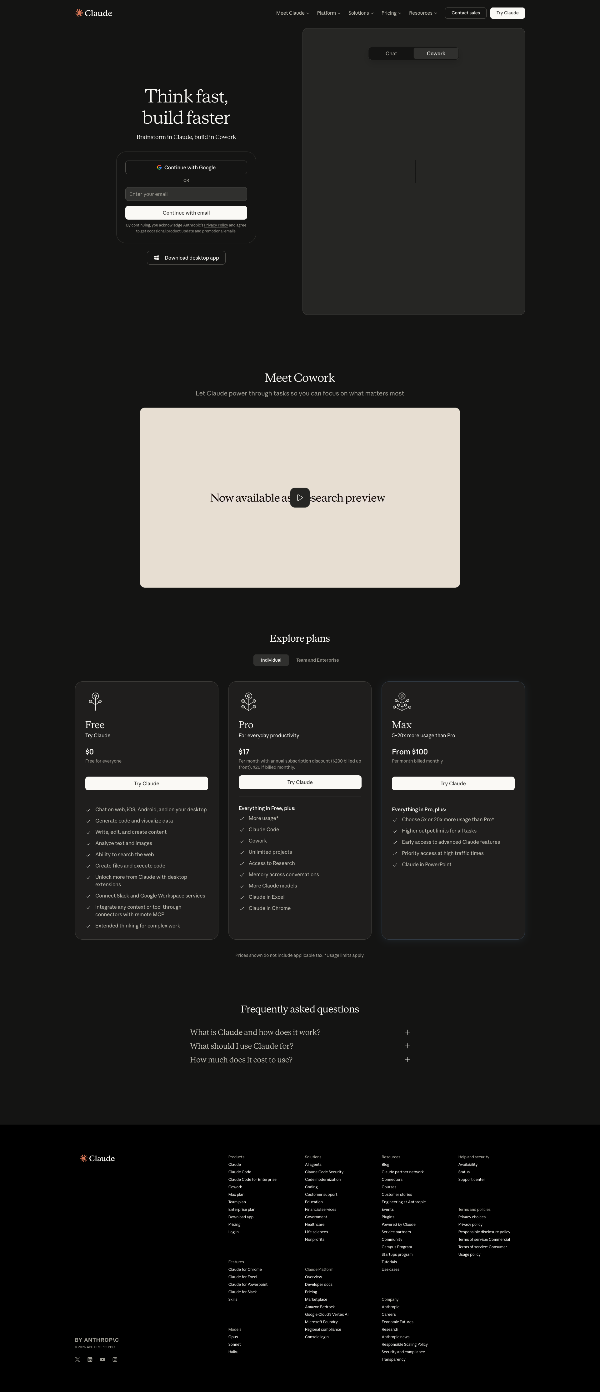
Claude was tested and 38 issues were detected across the site. The most critical finding was: Hero visual not loading; large placeholder panel visible on right. Issues span A11y, Performance, Other, UX categories. Persona feedback rated Visual highest (7/10) and Accessibility lowest (5/10).
Qualitative Quality
Claude
Category Avg
Best in Category
Pages Tested · 3 screenshots

Homepage
claude.ai

claude.ai
Detected Issues · 38 total
1
Hero visual not loading; large placeholder panel visible on right
CRIT P9
Prompt to Fix
The hero right panel should display the product illustration. Replace the placeholder with the actual hero image (ensure correct file path). If the image is still loading, implement a proper skeleton or fallback image with accessible alt text and maintain layout stability.
Why it's a bug
The right-hand hero area shows a large gray placeholder with cross lines instead of the intended image or illustration. This creates a broken first impression, reduces trust, and prevents users from seeing the core product vision immediately.
Why it might not be a bug
If intentionally using a placeholder during development, it should be clearly labeled or replaced before release to avoid confusing users. Without a label, this reads as a broken asset rather than a deliberate design choice.
Suggested Fix
Replace the placeholder with the actual hero illustration or product mockup. Ensure the asset path is correct and assets load reliably. Add a lightweight fallback image or skeleton that communicates loading state without appearing broken.
Why Fix
A functioning hero visual is critical for credibility and immediate user comprehension of the product value. Fixing this improves first impressions and engagement.
Route To
Frontend Engineer
Page
Tester
 Mia · Usability Tester
Technical Evidence
Elements:
Hero section with two-column layout: left signup/form area, right large image placeholderConsole:
[Broken asset] GET /assets/hero-visual.png 404 or blocked by CSPNetwork:
GET hero visual asset (404/blocked)Page Text:
Think fast, build faster (left) and a large empty/gray hero panel (right) placeholder2
Interactive button with empty label (no accessible name)
CRIT P9
Prompt to Fix
In the button component that renders without visible text, ensure there is either visible text or a non-empty accessible name. Add aria-label or aria-labelledby to identify the button's purpose (e.g., <button aria-label="Submit">Submit</button>). Verify WCAG 2.1 success criteria 2.5.3 (Label in Name) and 4.1.2 (Name, Role, Value). After fix, test with a screen reader and keyboard navigation.
Why it's a bug
A button rendered with no visible text and no accessible name cannot be announced by screen readers and offers no indication of its purpose to keyboard or screen reader users, violating WCAG 2.1 success criteria for meaningful name and purpose.
Why it might not be a bug
If the control is decorative or intentionally icon-only with a proper aria-label, it could be acceptable; however in this screenshot the button shows no text and no accessible name, indicating a misconfiguration.
Suggested Fix
Provide visible text for the button or add a proper aria-label/aria-labelledby. Ensure all interactive controls have non-empty accessible names. If the element must be icon-only, set aria-label and/or aria-labelledby and consider role accordingly.
Why Fix
Accessible names are essential for screen reader users and keyboard navigation, enabling them to understand and activate controls reliably.
Route To
Frontend Developer / Accessibility Engineer
Page
Tester
 Alejandro · Accessibility Specialist
Technical Evidence
Console:
[ERROR] Executing inline script violates the following Content Security Policy directive 'script-src 'self' ...'3
Link with empty text (anchor without accessible name)
CRIT P9
Prompt to Fix
Identify the anchor element with empty text and add an accessible name. If it uses an image, ensure the image has meaningful alt text and the link contains visible text or an aria-label. Example: <a href="https://claude.ai/login" aria-label="Login">Login</a> or <a href="https://claude.com/contact-sales">Contact sales</a>. Ensure WCAG 2.1 compliance for link text and name.
Why it's a bug
An anchor element has no visible text and likely no accessible name, making it inaccessible to screen readers and keyboard users. This prevents users from understanding the purpose of the link.
Why it might not be a bug
If the anchor’s purpose is conveyed by an embedded image with proper alt text, it could be acceptable; however the data model shows empty text for the link itself, indicating a missing accessible name.
Suggested Fix
Add descriptive text inside the anchor or provide aria-label/aria-labelledby. If the link contains an image, ensure the image has alt text describing the destination and the link text is not empty.
Why Fix
Descriptive link text or an accessible name helps screen readers convey link purpose and supports keyboard navigation.
Route To
Frontend Developer / Accessibility Engineer
Page
Tester
Alejandro · Accessibility SpecialistTechnical Evidence
Console:
[WARN] The App ID in your code snippet has not been set. Set it to your App ID found in settings to complete installation: https://app.intercom.com/a/apps/_/settings/web