Boldstart Ventures
App Quality Report
Powered by Testers.AI
B85%
Quality Score
25
Pages
37
Issues
7.5
Avg Confidence
6.5
Avg Priority
19 High18 Medium
Testers.AI
>_ Testers.AI AI Analysis

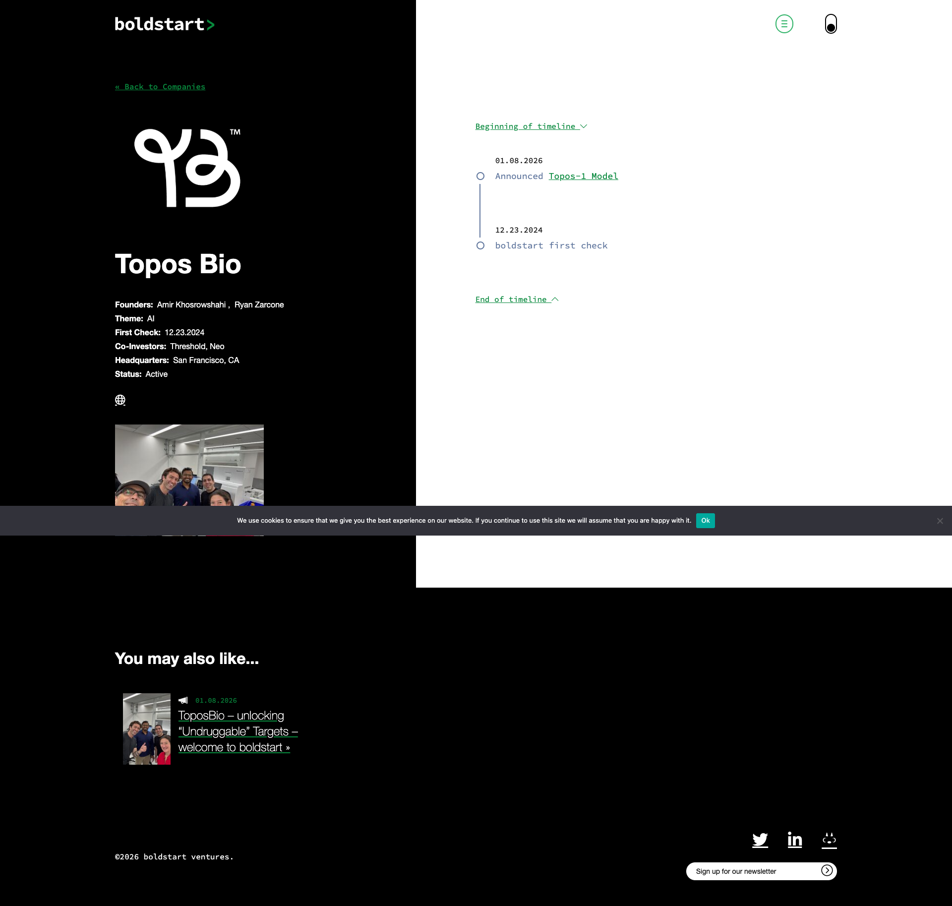
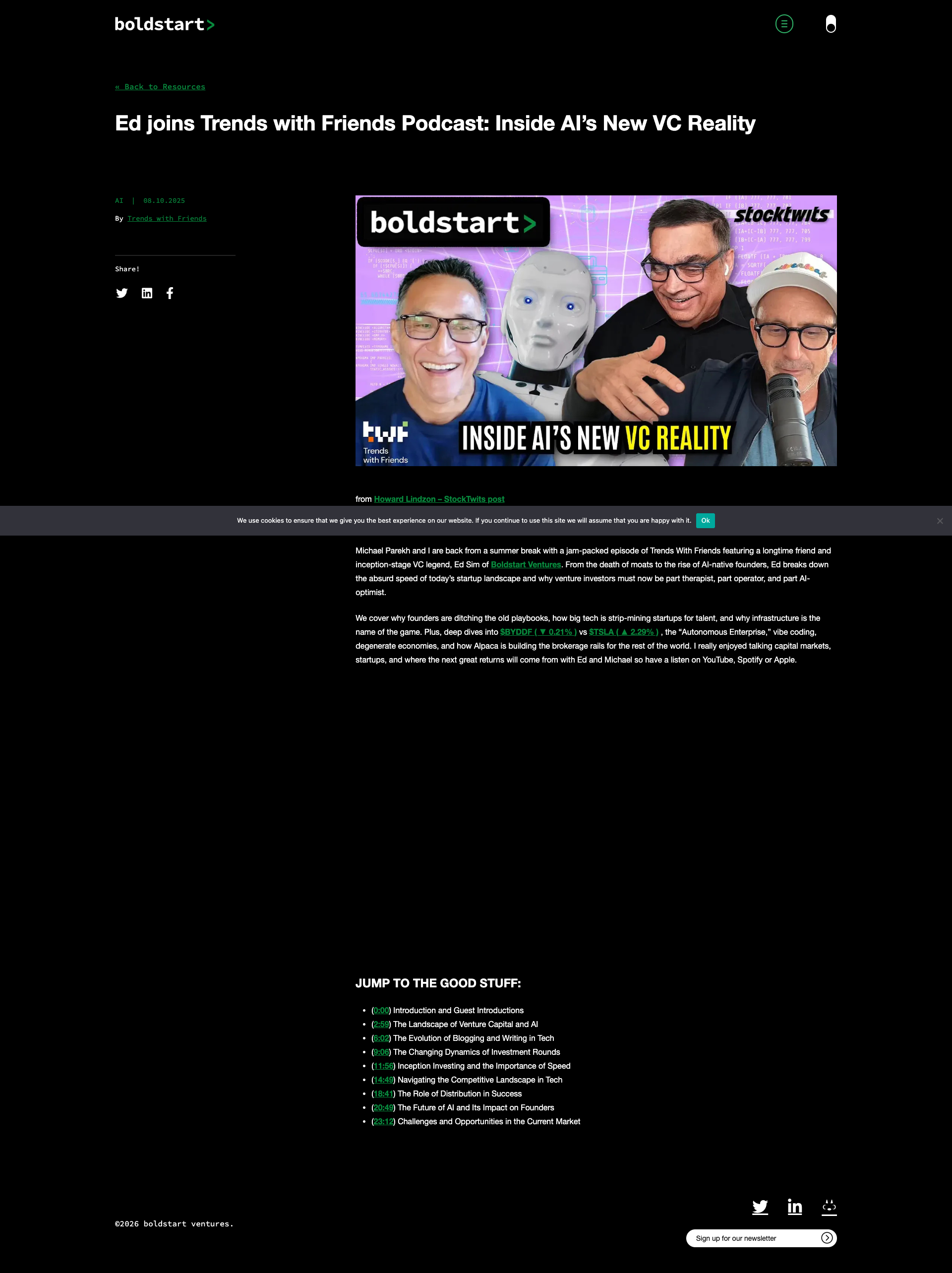
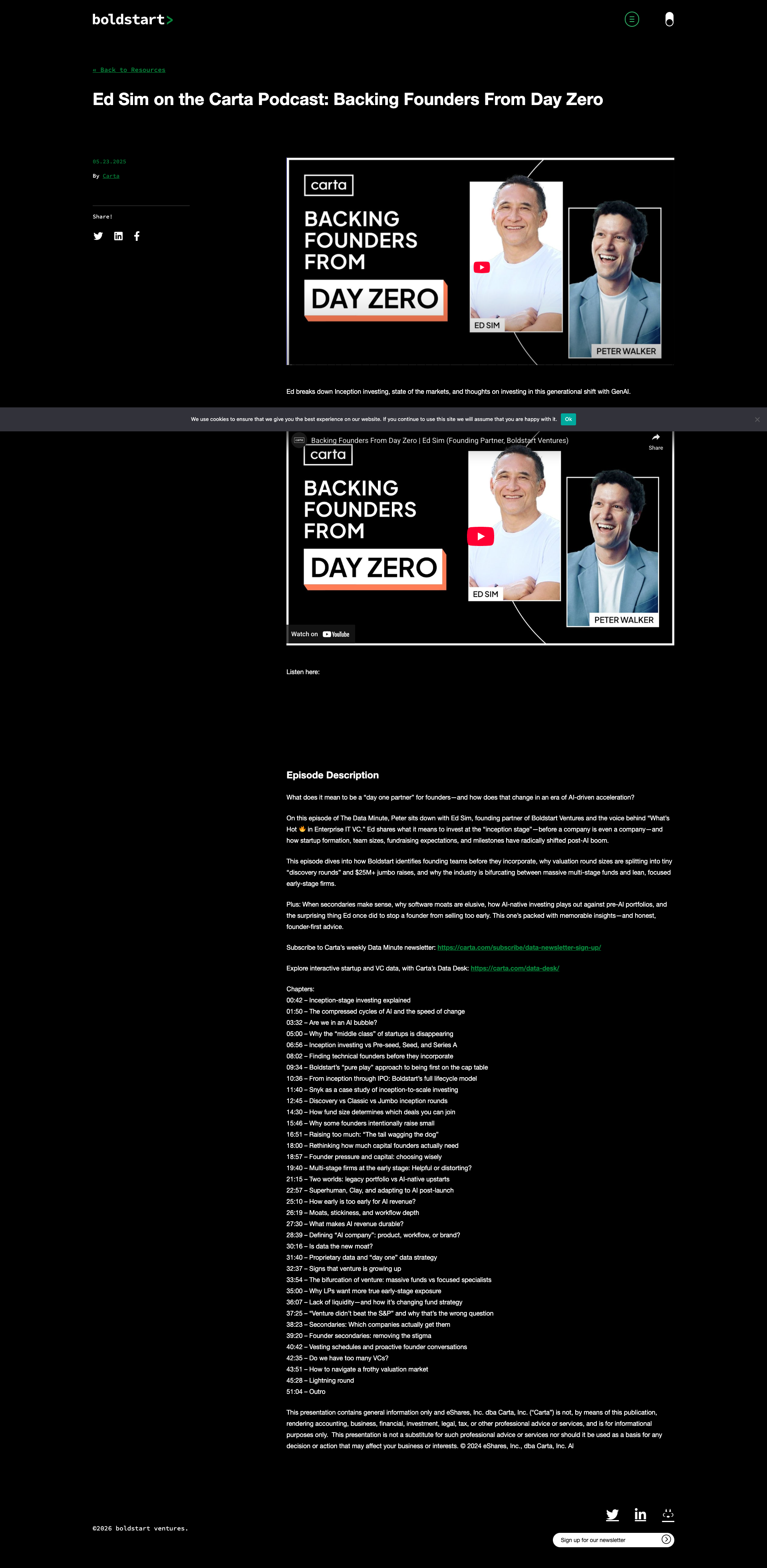
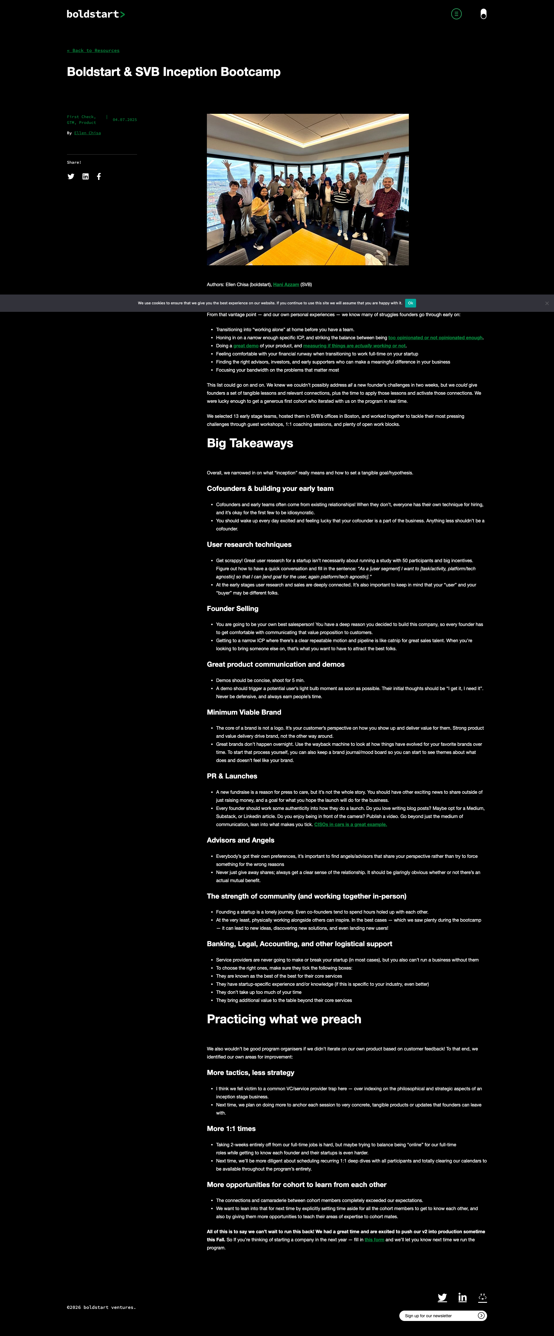
Boldstart Ventures scored B (85%) with 37 issues, ranking #42 of 47 VC sites. That's 14 more than the 22.7 category average (9th percentile).

Top issues to fix immediately: "Unreadable text in dark-themed content boxes" β€” Either lighten the background color of the box to improve contrast, or use white/very light text that contrasts suffi...; "Unreadable body text due to low contrast" β€” Increase the contrast ratio of the body text by either: 1) Making the text white or significantly lighter, or 2) Addi...; "Low contrast text on dark background reduces readability" β€” Increase the brightness/saturation of text colors, or add subtle background overlays behind text to ensure minimum 4.

Weakest area β€” accessibility (5/10): Dark theme may cause strain for some users. Text contrast ratios need verification.

Quick wins: Add a light mode toggle to accommodate users with visual sensitivities or those in bright environments. Implement portfolio filtering by industry, stage, or location to improve usability.

Qualitative Quality
Boldstart Ventures
Category Avg
Best in Category
Issue Count by Type
UX
34
A11y
25
Visual
8
Content
8
Pages Tested Β· 25 screenshots
Detected Issues Β· 37 total
1
Unreadable body text due to low contrast
HIGH P8
Conf 8/10 VisualUXA11y
Prompt to Fix
The issue is that body text has insufficient contrast against the black background making it unreadable and inaccessible. Fix it by increasing the text color to white or a much lighter shade to meet WCAG AA standards of at least 4.5:1 contrast ratio.
Why it's a bug
The main body text content in the middle section of the page appears to be very light gray or low contrast against the black background, making it difficult to read. This is clearly visible in the screenshot and violates WCAG 2.1 AA contrast requirements (minimum 4.5:1 for normal text).
Why it might not be a bug
The text may be intentionally styled for aesthetic reasons, though this would still be a poor UX choice that negatively impacts accessibility.
Suggested Fix
Increase the contrast ratio of the body text by either: 1) Making the text white or significantly lighter, or 2) Adding a semi-transparent background layer behind the text, or 3) Adjusting the text color to meet WCAG AA standards (minimum 4.5:1 contrast ratio).
Why Fix
Improved readability and accessibility compliance ensures all users, including those with vision impairments, can easily consume the content. This is essential for user experience and legal compliance.
Route To
Frontend/UI Engineer
Page
Tester
Sharon Β· Security Tester
Technical Evidence
Elements: <p> tags containing main content, likely with color property needing adjustment
Page Text: Multiple paragraphs of body text visible in the central content area
2
Unreadable text in dark-themed content boxes
HIGH P8
Conf 7/10 UXA11y
Prompt to Fix
The issue is text within dark-themed content boxes is nearly unreadable due to insufficient contrast. Fix it by using white or very light colored text that provides sufficient contrast against the dark background, or by lightening the background color of the boxes.
Why it's a bug
There is a dark gray/charcoal box visible in the middle section of the page (appears to contain a question and answer format) where the text is extremely difficult to read. The contrast between the text and the dark box background is severely insufficient, making the content nearly illegible.
Why it might not be a bug
This could be intentional placeholder styling, however it severely impacts usability for all users, not just those with accessibility needs.
Suggested Fix
Either lighten the background color of the box to improve contrast, or use white/very light text that contrasts sufficiently against the dark box background.
Why Fix
Users cannot effectively read the content in these boxes, defeating the purpose of displaying the information. This is a critical usability issue.
Route To
Frontend/UI Engineer, Accessibility Specialist
Page
Tester
Sharon Β· Security Tester
Technical Evidence
Elements: <div> or <section> with dark background containing text content
Console: No visible console errors
Page Text: Question and answer content in dark themed boxes
3
Duplicate podcast episode cards with identical content
HIGH P7
Conf 9/10 UXContent
Prompt to Fix
The issue is duplicate podcast episode cards displaying identical content ('Backing Founders From Day Zero'). Fix it by removing one of the duplicate card instances and keeping only a single, non-duplicated episode card on the page.
Why it's a bug
The screenshot clearly shows two nearly identical podcast episode cards stacked vertically - both displaying 'BACKING FOUNDERS FROM DAY ZERO' with the same two speaker images. This appears to be unintentional duplication of the same content, which creates visual clutter and poor UX.
Why it might not be a bug
It's possible this is intentional carousel content or a design choice to show the episode in different layouts, though this is unlikely given the identical content and apparent lack of distinguishing features.
Suggested Fix
Remove the duplicate card and keep only one instance of the episode card, or if both are needed, differentiate them with different content or clearly indicate they are different views/formats.
Why Fix
Reduces cognitive load, improves page clarity, and prevents user confusion about whether they're viewing different episodes or the same content twice.
Route To
Frontend Engineer / UI Developer
Page
Tester
Sharon Β· Security Tester
Technical Evidence
Elements: <div class='podcast-episode-card'> (appears twice with identical content)
Page Text: BACKING FOUNDERS FROM DAY ZERO
+34
34 more issues detected  View all →
Cookie consent banner obscures team member content
Text readability issue - low contrast between text and backg...
Cookie consent banner obscures footer content
and 31 more...
Unlock All 37 Issues
You're viewing the top 3 issues for Boldstart Ventures.
Sign up at Testers.AI to access the full report with all 37 detected issues, detailed fixes, and continuous monitoring.
Sign Up at Testers.AI or let us run the tests for you